Analyzing Maps
Overview
The map is one of the oldest forms of nonverbal communication. Humans were probably drawing maps before they were writing texts. Mapmaking may even predate formal language. As far as historians and geographers can determine, every culture in every part of the world uses and makes maps. This deep lineage reflects the descriptive usefulness of a map—a map is one of the best proofs that a “picture is worth a thousand words.”
To demonstrate this, try this brief experiment: try describing to a friend precisely where you are now, the route you took to get to this place from your previous location, where you are in relation to, let’s say, the nearest food market and or the post office, and the route you would take to get to those two places. You’ll find that it’s very hard to effectively formulate this explanation—which requires that you create an image of space, place, relational geography, and direction—using only words. I wouldn’t be surprised if you soon find yourself drawing “air-maps,” gesturing forcefully with your hands. If you’re sitting at a kitchen table, you’ll probably start sketching an imaginary picture on the table-top, using the salt and pepper shakers as place-markers. Congratulations, you’ve just made a map!
Essay
What Makes a Map?
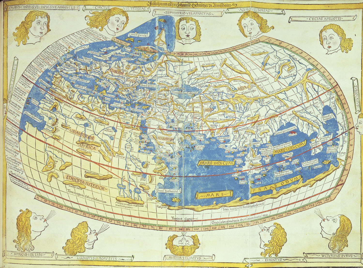
What is a map? By this, I mean to ask what is a “formal map,” of the kind that historians are most likely to study (your kitchen-table imaginary tracing is an informal, ephemeral map). It is almost impossible to arrive at a single authoritative definition of what constitutes a “map.” There are too many varieties of map-like sketches, too many pictures that look like maps and maps that look like pictures, too many ephemeral representations of spatial relations for us to say simply and finally what a map is and isn’t. Geographers and cartographers are continuously embroiled in ongoing debate about this very question. But without doing disservice to this rich discussion, we might distill the conventional wisdom about maps to a few key elements:
A map is a representation of space or place, or of phenomena as they exist in space. A map portrays geographical features, spatial features, or a “geography.” A map can be of micro-space (the layout of your bedroom), or of the biggest expanse we know, perhaps a schematic of the cosmos.
A map represents three-dimensional reality, but usually it is drawn on a flat two-dimensional plane (often a piece of paper). To “translate” effectively between these dimensions, the mapmaker employs various cartographic devices, especially “scale” and “projection.” Most maps have formal elements printed right on the map that give you guidance about how the mapmaker has represented the scene: directional information, keys, and scales are part of most maps. In the next section you’ll learn how to use these devices.
A map is much smaller than its subject, sometimes by astonishing degrees of magnitude—for example, a map of the largest country in the world (Russia) might be rendered on a piece of paper as small as an index card. Because of this size differential between real geography and mapped geography, mapmakers must be selective—a map can’t represent all of “reality” in absolute terms, but only some parts of reality. Which parts of “reality” get included on a map varies: first of all, selectivity is determined by the mechanics of drafting and the limitations inherent in drawing big objects on small pieces of paper; but selectivity is also subjective and which parts of “reality” get put on a map depends on the purpose of the map, the mapmaker’s intentions, and the mapmaker’s biases and preferences.
Why bother with maps?
Maps are rich historical sources. Like narrative documents, both the form and substance of historical maps tell a story. The “form” of an historical map—its artwork, its “style” and presentation—in itself provides an insight into past eras and cultures. The “substance” of a map (what it shows, literally) provides a record of past landscapes and features that may no longer exist. It also reflects the priorities, sensibilities, fears, and the state of knowledge of the mapmaker and his or her cultural context.
A map offers a reader a new dimension of analysis, a visual dimension. One of the particular advantages of a map is that it conveys nonlinear and simultaneous knowledge. In a single glance at a map, a reader can tell what’s going on over the whole map at a single moment in time.
In a single frame, a map also offers rich contextualization that might otherwise take pages and pages of text to convey. Because of its visual properties, almost by definition a map represents its subject in a broader context—that is, in drawing any single place, the mapmaker also situates that place in relation to other nearby places. Sometimes “relational geography” is the primary purpose of a map (to show how close A is to B), and sometimes this contextualizing effect is just a fortuitous byproduct of the nature of graphic representation.
On the other hand, a single map is not very effective at showing “process.” A narrative can move a reader through time very quickly; a map tends to be static and to show a single place at a single moment. A map then, in distinction from written texts, can be understood as privileging place over process, contextuality over linearity.
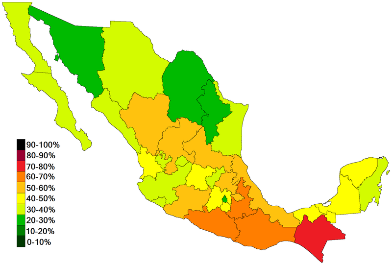
“Thematic mapping” is a particularly powerful geographic tool. A thematic map shows the distribution of “non-geographic” features and phenomena (social, cultural, political, or economic features) in their geographic context: for example, a map of poverty rates across a city or country or a map of the distribution of deaths from cholera are “thematic” maps. In showing not only what is happening but where, thematic mapping makes patterns visible—similarities and differences, continuities and contrasts across space—that would be extremely difficult to discern in a narrative treatment.
What can maps tell us?
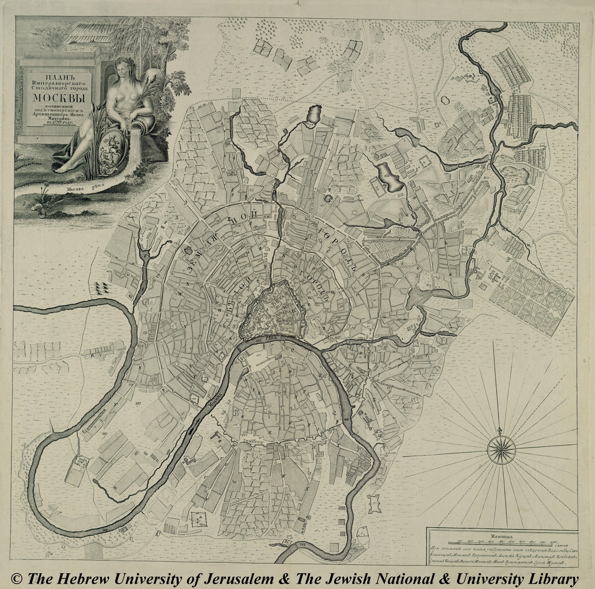
The variety of roles that maps play is astonishing. While one map might provide a simple portrait of place and a record of the contemporary landscape, another will be intentionally designed as a commercial census of the people and resources of a place. Yet another offers a glimpse into the fanciful imagination or the great artistry of the mapmaker. Sometimes a single map offers all these insights at once. To look at a historical map is to step into the past; to look at an old map is also to see the world as it would have been seen by the elites, the government, the military, or the navigators of the day. The 1794 map of Moscow below, for example, reveals several interesting historical features: compared with the modern sprawling metropolis, 1794 Moscow appears to be a quite small and compact city; the map shows the remaining inner wall of what was once a heavily fortified city; churches, the names of which constitute most of the map legend, are evidently a key feature of the 1700s Moscow landscape. A fascinating historical exercise might be to follow a sequence of maps of the same city over time—doing so, you can watch the city grow and change before your eyes.
But we must always be aware that the view a map offers is partial and particular. Readers often assume that maps are inherently more “objective” than written narratives. Maps often look as though they are presenting “just the facts.” A map that shows the cities of Japan in 1790, for example, or a map of the topography of Barbados in 1885, seems to offer little scope for interpretation or subjective manipulation. Either a city is there or not, a mountain is there or not!
Well, yes and no.
Geographer Denis Wood reminds us that maps “are embedded in a history they help to construct.” Unpacking this quote, Wood is pointing to two aspects that a critical reader needs to bring to his or her encounter with maps:
- like all other historical sources, maps can be simply “factual” but they must also be read carefully as contextualized documents. Maps are made at a particular moment in time by people who are embedded within a social and personal context of hopes, dreams, biases, predilections, and vested interests that can and do influence the map.
- maps don’t just reflect “reality,” they help to create it. Mapping something gives it an aura of authority and permanence—sometimes deserved and sometimes not!
Historians use historical maps for several purposes:
- As tools for reconstructing the past, to the extent that maps provide records of features, landscape, cities, and places that may not exist any more or that exist in dramatically transformed form.
- As records of certain historical processes and relationships. Maps of trade routes, for example, if available in a sequence over two or three time periods, will paint a portrait of processes such as the pace of European expansion over the globe.
- As representations of the “worldview” of the mapmaking culture, and how that culture saw its place (literally and metaphorically) in the world at the time the map was made.
How do I read a map?
Orientation
When you have a map in front of you, you might first want to figure out “which way is up” and “where is this place?”
On almost all maps north is “up,” at the top of the page (yes, including those made in the southern hemisphere). Many maps include a directional arrow or compass to more precisely indicate the map’s cardinal orientation. You will notice that on many 16th- and 17th-century maps the compass part of the map is richly illustrated and is often a commanding piece of artwork in itself. Some maps also include a latitude and longitude grid overlaid on the map itself, or running around the border of the map. In addition to directional information, if you know latitude and longitude information then you can figure out quite precisely what part of the world the map is illustrating.
Title, Date
Most maps include a title and sometimes a date. The rhetorical style of titling on historical maps often exceeds the merely descriptive: for example, Herman Moll, a famous Dutch mapmaker working in London, titles his 1732 map, “A New and Exact Map of the Coast, Countries, and Islands within the Limits of the South Sea Company, from ye River Aranoca to Terra del Fuego, and from thence through ye South Sea, to ye North Part of California &c. with a View of the General and Coasting Trade-winds and Particular Draughts of the Most Important Bays, Ports &c.” Moll was not alone among mapmakers either in wordiness nor in taking the opportunity of the title to assert the reliability of their handiwork.
Scale
How big is the place shown on this map? What’s the distance between points on the map? How far is it from one end of the island to the other? How long is that road? Most recent maps (those made after the 18th century) include a scale. The scale is a reader’s key to the mathematical principles that the mapmaker used to shrink the representation of space, size, and distance. Most map scales are pretty easy to understand: at their simplest they consist of a linear bar with distance equivalents written beneath. Thus the map scale might be something such as “1 inch = 250 miles.” This means that every linear inch on the page equals 250 miles in “reality”: a road drawn on the map as about an inch-and-a-half long represents a road that is almost 400 miles long in reality.
On the oldest surviving maps, however, it is harder to answer questions of scale and distance. Art historians tell us that principles of “proportionality” and “perspective” didn’t work their way into the Western art tradition until the late 15th century. Uniform scales didn’t routinely appear as part of the mapmaker’s art until then. Thus on old maps, size relationships between objects often appear to our modern sensibility to be wildly distorted or fanciful. For example, a ship on the ocean might be drawn at twice the size of a mountain on the coastline. All maps represent a balance between artistic representation and geographic fidelity. On older maps, the balance seems to lie more in favor of artistic license.
Key/ Legend
Mapmakers often use symbols or codes to represent certain features. For example, on a city map, a cross might indicate a hospital or on a landscape map, swamps might be marked by a series of dashed lines. Many maps include a “key” or “legend” that explains what the map symbols mean. Inclusion of a key or legend is more typical on modern maps than old maps, but some symbolization is included on almost all maps. Sometimes the symbols are fanciful and can be read as miniature art pieces in their own right.
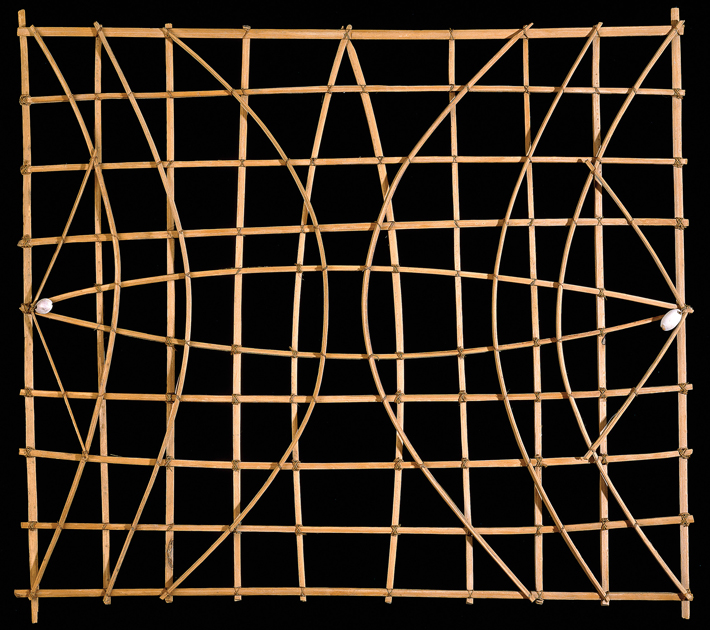
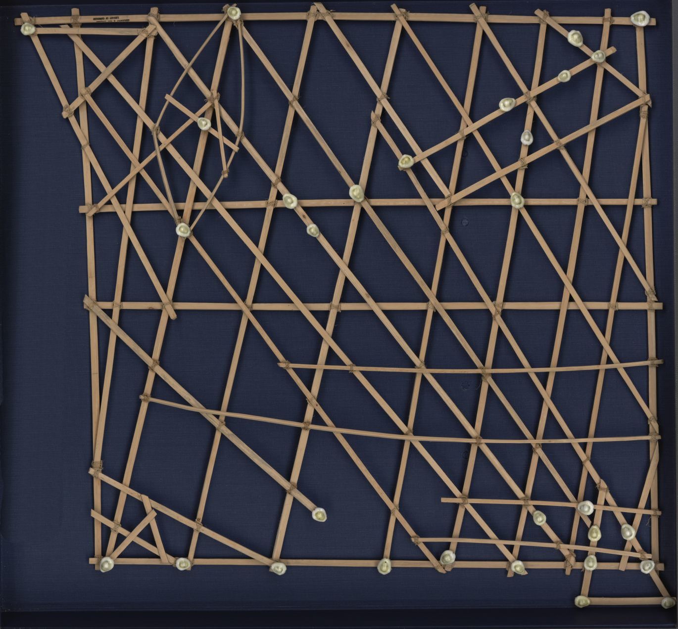
Map traditions often reflect particular needs, skills and local materials. The Polynesians, for example, from the 5th century BCE through 500 CE were great sea voyagers. They routinely crossed the vast expanses of the Pacific, establishing trade and communications routes and migrating across thousands of miles with none of the paraphernalia of paper maps, compasses, or sextants that later European trans-Pacific explorers relied on. Instead, the Polynesian seafarers developed three-dimensional stick-and-reed maps that marked currents, winds, and key navigational points. These maps were typically made of strips of coconut leaf stems or pandanus root on a frame: strips which were curved show the altered direction of swells deflected by an island, and their intersection an area of confused sea—a valuable indicator of position. Island currents may be shown by short straight pieces. The stick-charts from the Marshall Islands, below, were used to teach and record the swells of the sea itself, a science that is largely unknown outside the Pacific. These charts are not maps in a Western sense: cowrie shells woven into the charts might signify islands, but they could often be taken to be any island; distances were quite arbitrary, and charts were meaningless without the guidance of their maker. What these maps show is the nature of swell movement and general principles of the relationships of ocean currents and waves to land masses and winds.
Who made this map? When? Why?
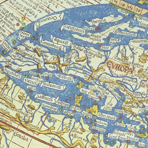
Maps reflect the particularity of broader geographic knowledge of the time. For example, maps dating before the 15th century typically reflected (and reinforced) the certainty that the earth was flat. Medieval European maps were often more allegorical or ecclesiastical than cartographic, as in the 12th-century map below.
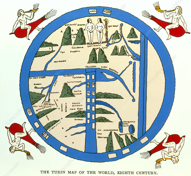
We can thus “read” a historical map not only for insight into the particular mapmaker’s skill and imagination, but as a window into the bigger worldview and cultural context within which the map was produced.
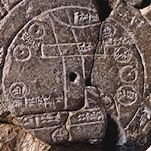
Most of the formal elements of cartography (scales, compasses, legends) reflect relatively modernist (post-15th century) and Western traditions. In the very earliest maps, space is fluid, there are no regular mathematical principles that determine the location and sizes of places, and “directionality” in our modern sense is almost entirely absent. The world’s earliest surviving maps, starting with ancient Babylonian clay tablets from the 6th century BCE through early Greek maps of the 3rd century BCE, typically show the world as a small landmass entirely encircled by a ribbon of water, as in the map below. The 5th century BCE Babylonian map below places Babylon at the center of the flat, round universe, with seven outer “islands” that reflect sketchy knowledge of other continents. On maps such as these there is no “up” as such, and the relationship of objects to one another is confusing to a modern reader, but the earliest maps provide important clues to the worldviews of early cultures.
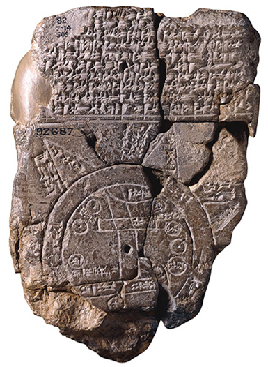
As part of our critical use of maps as historical sources, it is crucial to ask questions about the provenance and purpose of maps. Some of the evidence, above, about the style, language, and materials provide obvious clues to the nature and origins of historical maps. But sometimes a critical reader needs to be more interpretive.
Sometimes the purpose of a map seems to be straightforwardly geographical and unremarkable: as today, some maps in the past were made for purposes simply of “getting around” and as a record of where things are. But until recently, maps were relatively expensive to produce and required the efforts of skilled tradespeople to produce them. The “incidental” and mass production of maps, such as the ubiquitous placemat maps that we find today on tables at tourist roadside restaurants, is very much a modern hallmark.
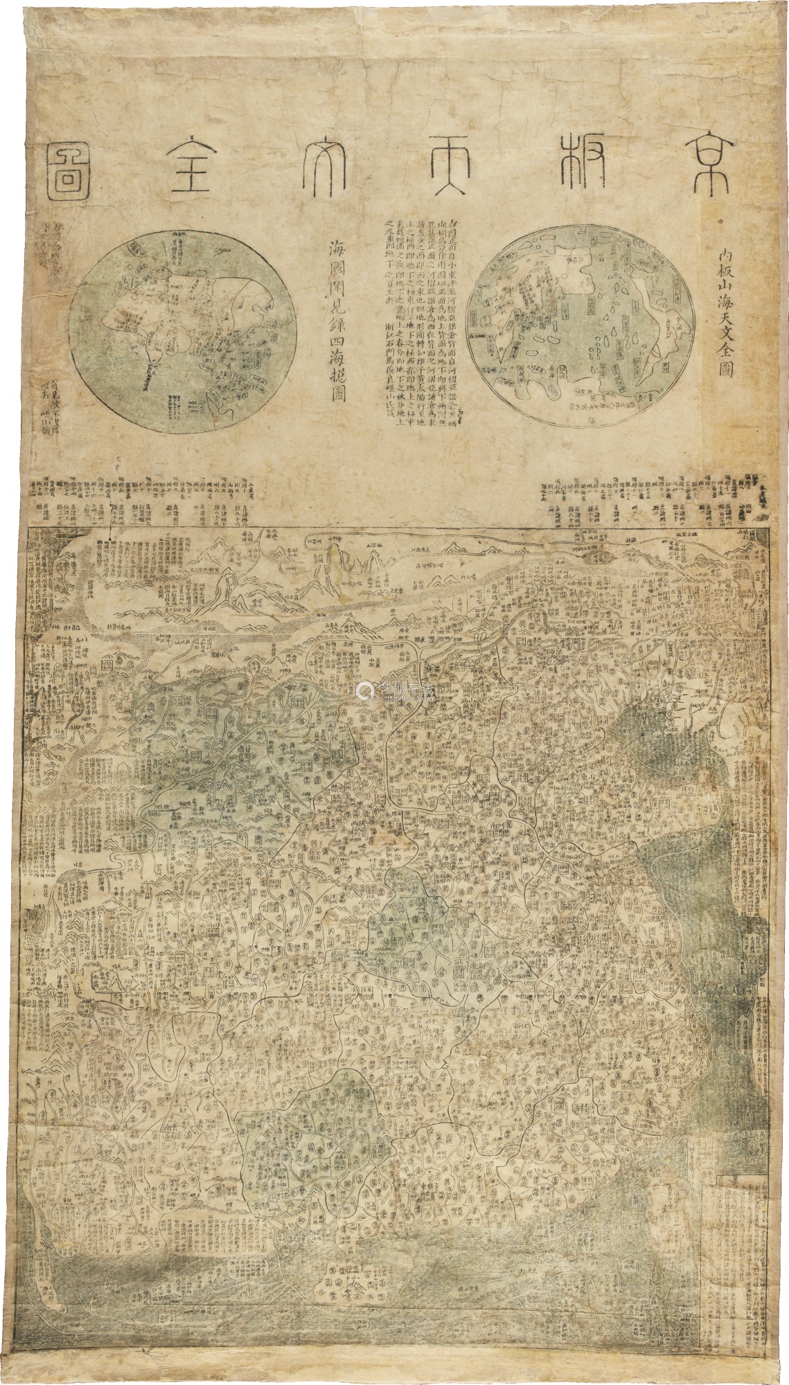
One of the first things to remember is that most mapmakers were “egocentric” in their mapmaking. So, for example, on a 19th-century Dutch world map, Western Europe would almost invariably be at the focal center of the map. But all mapmaking cultures tend to reflect self-referential centering. The Chinese “Jingban tianwen quantu” map from the 1780s, below, is a wonderful illustration of this: at the top of this map is a two-hemisphere view of the world; in both the eastern and western hemispheric view, China takes up most of the map with all the other continents squeezed into the edges. This map also illustrates the Chinese cartographic convention of including considerable narration on the map itself; European maps of the same time typically include very little writing (other than locational identifiers).
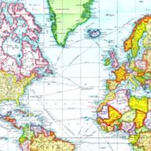
In the late 1500’s Gerhard Mercator, a Flemish geographer, developed a map projection that represented a remarkable advance in navigation and map reliability—but it was one that also standardized Eurocentric representation on world maps. The Mercator projection distorts the geography of the northern latitudes, making Europe appear much larger than it really is—Greenland at 16 times its actual size, for example.
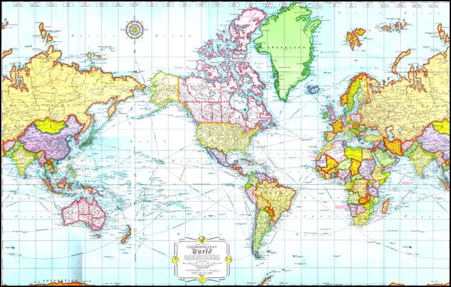
The dominance of the Mercator projection has been challenged recently by projections that try to counter this Eurocentrism; one of the most prominent being the Peters projection, below, but this map too distorts geographical relationships by distorting shapes of countries and continents. All map projections distort something—size, shape, relative location— simply because of the mathematics of reproducing a sphere (the world) on a flat piece of paper (the map).

Just as narratives are authored, so are maps. Most of the maps we encounter in daily life today are mass produced by anonymous workers as part of a commercial map-production process. But maps dating from the 19th century or earlier tended to be produced one at a time or in small batches, were often hand-colored by map colorists (an occupation in itself), often produced for a specific purpose and commissioned by a specific political figure or commercial company, and were often considered to be works of art. Some individual mapmakers achieved great fame and prominence. The direct authorship of many surviving historical maps is well known, and historians of cartography can identify the handiwork of specific mapmakers by the style and detail of surviving maps. Maps are palettes for the artistic, sometimes quirky, imagination of their author. The 12th-century map of the world, below, is a particularly fanciful combination of cartography, myth, and religious belief. Typical of these earliest maps, the known world is shown entirely encircled by water, with continents arranged in what appears to be a random pattern; one of the main features of the map is the placement of Eden at the top.

Even if we don’t know the mapmaker as an individual figure, maps are “authored” in a broader conceptual sense. The richly colored, ornate maps that survive in historical collections today tend to be maps that were produced by and for elites. Historically, only a small subset of the population in most countries had the resources to make, read, or commission formal maps. Maps that were produced for specific purposes of consolidating commercial or political power were the most “valuable” and thus are the most likely to have survived into today’s archival collections. Ordinary maps, vernacular maps, and informal maps are less likely to be available to today’s historian. A large share of the maps that survive in Western collections today are “exploration and discovery” maps—maps created by European explorers who were scouring the world in the name of commercial or colonial conquest. Many of these maps were designed to inventory the populace, the resources, and the commercial opportunities available in new lands.
Maps don’t just reflect reality, they also shape it. Maps didn’t just record the encounter with new geographies; they played an active role in shaping it. Mapping was an essential tool in the European colonial expansion around the globe from the 15th through the 20th centuries. The first nation or commercial interest to produce a map of a new place could thereby claim ownership of it, and the race to produce a reliable map of new territories was often intense and bloody.
Sometimes the colonial, military, or commercial purpose of a map is immediately apparent in the map itself. But not all maps serve this purpose. Many maps seem to simply offer a record of landscapes and places in a rich visual presentation—a snapshot of a place many centuries before photography was invented. Even then, however, there are key questions to ask about the circumstances under which the map was made.
Was this map made by an insider or an outsider? Was a map made “by” the people who live there, or is it a map “of” the place made by outsiders? Posing these questions can offer insight into the purpose of a map and also into its accuracy. The extent to which a map is a faithful record of real landscapes and places (and thus might be used as an accurate historical artifact) may depend on whether it was made with an insider’s knowledge or an outsider’s imagination. “Outsider” mapmakers often filled up landscapes with imaginary creatures and fictional features, as we will see in the interpretive model below. As Jonathan Swift remarks:
"So geographers in Afric-maps, With savage pictures fill their gaps; And o’er unhabitable downs, Place elephants for want of towns."
Many indigenous cultures were destroyed in the process of European colonial expansion and we just don’t know what kind of mapmaking traditions they may have had. The Mayans of pre-Columbian Central and South America, for example, were a large and complex society that no doubt had maps. However only a handful of intact Mayan manuscripts of any type survived the Spanish conquest, none of them with maps.
What choices did the mapmaker make?
Obviously not all details about a place or topic can be shown on a single map. The mapmaker selects which details to include, and which to omit. When you look at a map it is important to think about what is on the map and why, and what is not on the map, and why not.
Sometimes it’s impossible to know what is not on a map and what features the mapmaker has consciously privileged. But in general, the degree and nature of map-selectivity is dictated by several factors, including:
- the limits of drafting, scale, and size of the finished map: On an 8”x11” piece of paper, you could draw an extraordinarily detailed map of your bedroom, including the exact placement of doors, windows, and posters on the wall; drawing a map of Canada on the same size of paper, however, you could only show the major cities and geographic divisions and not much else.
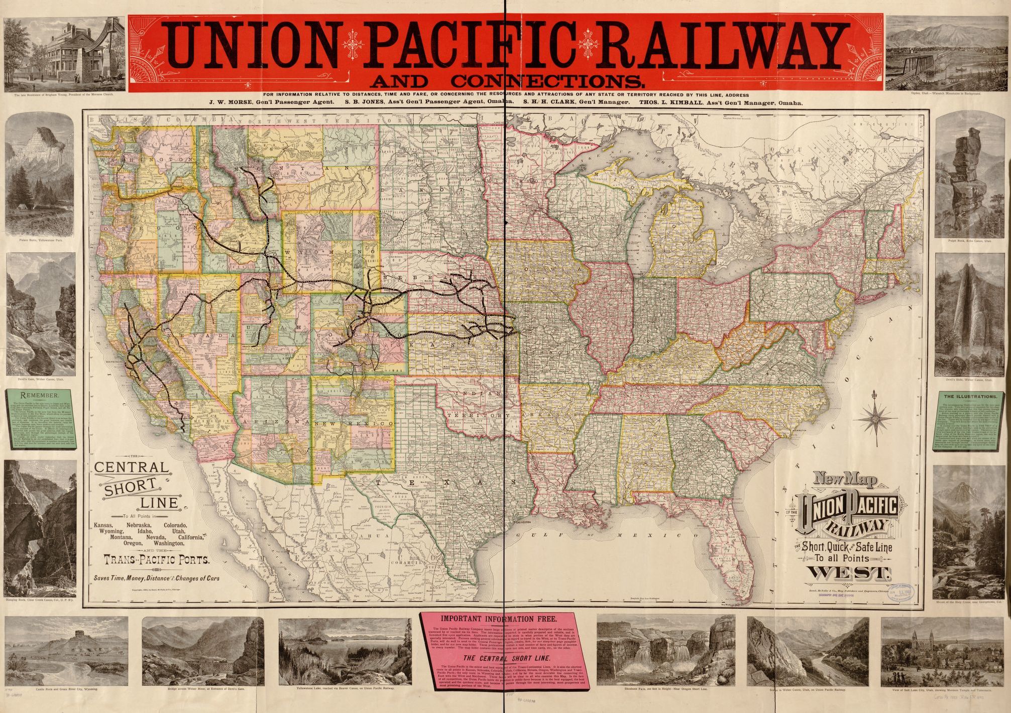
- the “politics of importance” and the contours of curiosity: For every feature included on a map, dozens are left off. For every map that is made, dozens are not. What individual mapmakers and societies find “interesting,” “important,” and worthy of study changes over time—and is influenced by myriad factors, including fashion, politics, social and economic currents. Few mapmakers today would bother making maps of whaling stations in the South Pacific (commercial whaling is currently practiced by only a few nations, and the use of whaling stations has all but ended). But in the mid-1800s, maps of whaling stations were highly prized commercial commodities and were produced at a frenzied pace. In the 1890s it was easy to find atlases and maps in the United States of wines, railroads, and voting patterns, but not a single map on the status of women.
- the purpose of the map and the audience served: A military map designed to guide an armed attack on a city will show quite different detail than a map designed to showcase the recreational parks and gardens of that same city. A map reflects not only what is “there,” but what the user needs to see—or what the mapmaker thinks the user wants to see. Sometimes purpose-driven design leads to outright fraud or fanciful embellishments on maps as mapmakers try to anticipate what users most want to believe is there. Sometimes this leads to deceit. For example, in the 1950s in the name of national security, Soviet mapmakers always left several large (strategically-important) cities off their maps and American maps always left off several large military facilities and testing ranges. As map readers, we hope or assume that outright fraud, deceit, or manipulation is at the extreme end of the purpose-driven design spectrum, but all maps are influenced by “purpose” and “audience.” A critical reader of historical maps needs to explore beyond the map itself in order to interpret the map.
How do I read beyond the borders of the map?
In addition to being influenced by its “purpose”, what is on any given map is influenced by a broader cultural or scientific knowledge or worldview of the time. For example, in the 17th century, most educated Western Europeans believed that there was an open polar sea at the north pole. This was the conventional scientific wisdom of the time. In consequence, maps of the Arctic routinely featured this sea, despite there being no actual evidence of its existence. In turn, the fact that so many maps showed an open polar sea reinforced the certainty with which its existence was argued. Maps have a circular and reciprocal relationship to received knowledge.
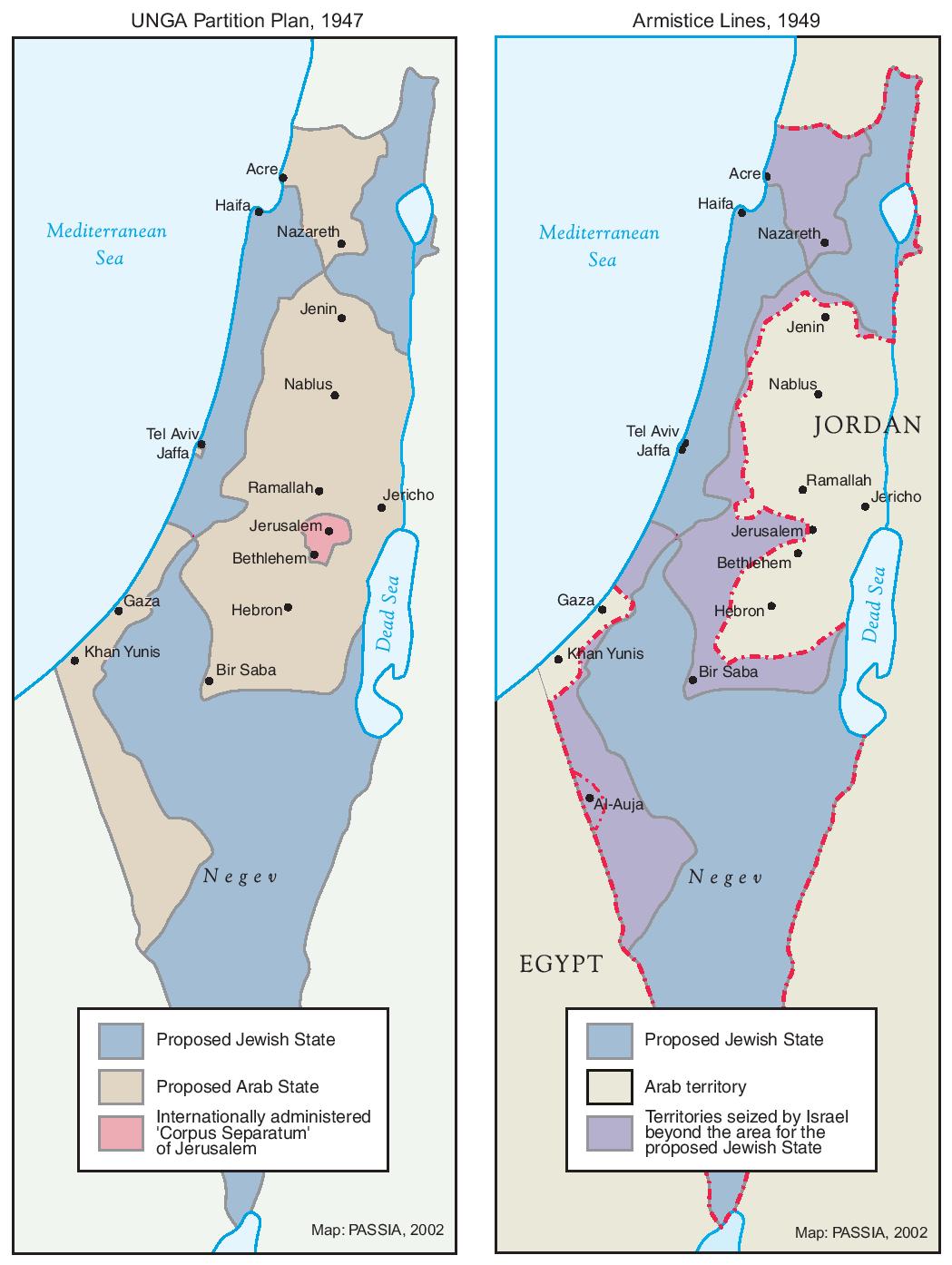
Maps are often central props in political conflicts. Today, for example, official maps in both Pakistan and India routinely include Kashmir as part of their national territory; where the West Bank boundary is drawn on Israeli or on Jordanian maps can be a matter of considerable geopolitical consequence. Indeed, maps were the main currency of geopolitical discussions around the creation of the state of Israel in the late 1940s—negotiators for British, Arab, Jewish, UN, and USA interests routinely traded maps with sometimes wildly varying boundary proposals as a way of pushing forward negotiations.
Geographers and historians often call on the maxim that “the map is not the territory,” but much of human history has proceeded as though it was.
Primary Sources
Sample Analysis
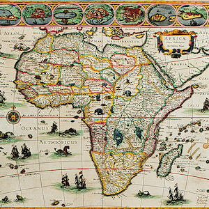
The “Africae novo” map, from the early 1600s, allows us to think through the interpretation of one historical map. Unlike some historical maps that are mysteries, we know the origins of this one: it was produced by a famous Dutch cartographer, Willem Blaeu, and published in his 1630 atlas. The atlas has survived in several copies, and this artist is quite well known. Blaeu was an instrument maker, a globe manufacturer, and an engraver. Like most cartographers of the time, he was not an explorer himself: he drew his maps from the accounts of explorers, traders, and travellers. He also no doubt used earlier maps as a basic template for his own.

Even if we didn’t already know that this was a Dutch map of Africa, we would interpret the map in the first instance as an “outsiders” map. Several features tell us that this is not a map drawn by Africans of Africa. The expanses of oceans, proportionately taking up a good deal of the entire map spread, and the prominence of the ships on the oceans, suggest that this is a view of Africa from a maritime perspective. It is hard to read some of the flags flying on the ships, but the Dutch flag—red, white, and blue horizontal stripes—is prominent on several. The ships are not drawn as if they were making landfall in Africa; instead, they are mostly headed south and east, around the Cape, and indeed, we know that European interest in Africa was largely spurred initially by the search for a fast route to the Indies.
The main language of the map is Latin—not an African language—with Dutch and English names also sprinkled throughout. The place names are interesting in all sorts of ways—as historical markers, as small individual historical puzzles, or as hints that help us contextualize the map. Many of the country names represented on this 1630 map are closer approximations of “native” names than we would find on maps a century or so later—since this map predates the full force of colonial rule in Africa, the names are also precolonial. “Benin,” for example, is the precolonial name included in this map; the name was wiped out when this territory was broadly incorporated into a single huge territory under French colonial rule called simply “French West Africa”; it wasn’t until 1975 (many years after postcolonial independence) that the country name Benin— its current name—was reintroduced. Names on the map such as “Nubia” (in what is now southern-interior Egypt and Sudan) reflect a more anthropological and historical bent, a reference to one of the great ancient kingdoms of Africa. Other place names, such as “Barbaria” (widely presumed to be a variant on “Berber”), would be familiar to 17th-century Europeans: the pirates and slave traders of the “Barbary Coast” were widely feared throughout northern Africa and southern Europe. “Oceanus Aethiopicus” —what we now call simply the southern Atlantic—is a historical remnant, a term first used by the Greeks in the 4th century BCE.
The map shows much more geographic detail for the eastern coast of Africa and the Mediterranean shores than for the south and west—another sure sign of the European exploration bias in this map. But overall, one of the key features of this map is how few details are actually mapped. The names of coastal towns and features are printed inwards into the continent, giving an illusion of density and comprehensive coverage—but if you look closely, you will see that the densest geographic knowledge portrayed on this map consists mostly of a thin ribbon along the coast. There are large sections of the interior of Africa that are blank—many of which are artfully covered with elephants, tigers, camels, monkeys, and the like. Africa was a thoroughly populated continent in the 1600s: the blank spaces clearly don’t reflect a reality that “nothing was there” — rather, they reflect the limits of European knowledge and curiosity, and the hierarchy of what was “important” to know about Africa from a Eurocentric view.
On closer examination we can see that this is almost entirely a coastal view of the continent. The sketches of towns that are included along the top border of the map—presumably among the principal settlements with which the Europeans had contact—are, with one exception, all coastal towns. It is not clear what criteria have guided the selection of these nine towns. One might surmise that they were towns best known to Europeans, but it is reasonable to assume that, even with limited exploration, more than nine settlements in all of Africa were known in to Europeans in the early 1600s. These might be major trading ports for the Dutch, or they might be the only towns known to Blaeu through the narratives of his raconteurs. Closer historical analysis is needed to understand the significance of these nine towns. Similarly, the portraits of figures in “native costume” that border the map warrant a closer study. The Europeans of the 17th century had a strong anthropological interest in “exotic” peoples. Blaeu’s portraiture reflects this interest—which is not to say that the portraits might not also reflect with accuracy some of the diversity of the peoples of Africa. The (few) women represented in the portraits seem to be the most heavily exoticized, but it is overall difficult to determine what parts fantasy and reality are embedded in these portraits.
In terms of its constituent cartographic parts, this map is particularly striking in several elements. Its geographic representation is quite accurate—the continent of Africa portrayed on the map is actually a close illustration of the scale and shape of the continent. Some of the key topographic features of the continent, such as the Great Lakes of eastern Africa, are also represented more or less accurately. The compass, straddling the equator, is richly detailed, with a strong flourish pointing north. The latitude and longitude grid adds more directional specificity. However, there is no scale or distance measure on this map. Other Blaeu maps do include scales and keys, but not this one—perhaps the view, of an entire continent, was too broad for Blaeu to think that a scalar measure would be useful. The lack of a scale is especially problematic in the portraits of the nine towns; without advice from the cartographer, it is impossible to tell how large or small these towns are or what are their sizes relative to one another. Common to maps of this era, artistic elements of the map are obviously out of scale: the animals in the interior of Africa and the ships on the oceans, for example, are drawn at a size that wildly distorts scale relationships.
The artistry of this map is breathtaking. The vivid colors, the artwork around the border, the fanciful creatures scattered over land and sea, all add to the sense that this was as much a work of art as a map. Even small details such as the title plate (known as a “cartouche”) are richly drawn and elaborated. This is a testament to the skill of the artist, Blaeu, and it also suggests that this map was a costly and valuable possession. This would not be a map in common circulation. It is not detailed enough or technical enough to serve as a navigational map—it clearly wasn’t a seafaring map. No doubt Blaeu’s readers included adventurers, mercantile elites, upper-class art collectors, and, perhaps, the emerging class of intellectuals who were simply curious about the “new” lands and foreign peoples who were part of the expanding worldview of the Dutch in the early 1600s.
Bibliography
Credits
About the Author
Joni Seager is professor of Geography at the University of Vermont. Her research interests are in feminist geography, environmental policy, and global political economy, all areas in which maps are essential aids in analysis, interpretation, and teaching. She is the author of an environmental atlas, The State of the Earth, and three editions of an atlas on the international status of women: The Penguin Atlas of Women in the World (2003). She is also the author of several non-atlas works, including, most recently, Putting Women in Place: Feminist Geographers Make Sense of the World (Guilford, 2001).
