Visualizing Energy:
Visualizing Energy: Data Stories to Guide an Equitable Energy Transition is a project out of the Boston University Institute for Global Sustainability that combines written essays with interactive data visualizations related to energy, sustainability, and health. This project lists its goals as creating accurate and trustworthy information to convey how sustainable energy is linked to human well-being and package it for educators, students, and the public. There are four listed parts at the center of the project, which are engaged storytelling, interactive visualizations, open content sharing, and active collaborations.
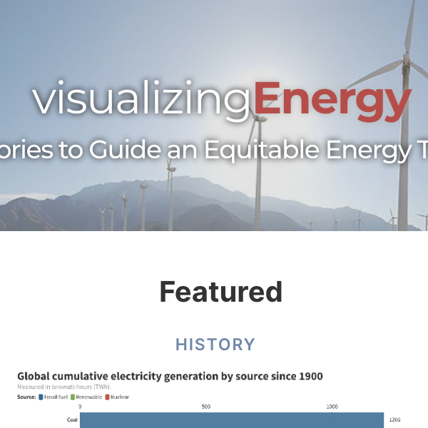
The main content on the website is the data stories, which are usually short-form essays that give definitions or touch on themes such as efficiency, consumption, price, and different forms of energy. By combining written analysis with data visualizations, this project displays how energy policy can affect health and equity in a way that makes it interactive and easy to understand. There are data stories that trace issues as far back as the 18th century, though many deal with more modern issues. The user can explore data stories through topics, tags, location, or a keyword search to find what is needed. Each data story includes interactive visualizations, often multiple, in the form of graphs, maps, and charts, among others. There are also topics, which give a definition and overview of the selected topic and also pull up associated data stories; topics include well-being, energy justice, and health.
This site could be helpful for both students and educators alike, but given the science and math surrounding the topic, this would likely be more useful for advanced high school students or even college students. The included data stories could be useful for history students studying the history of technology or a global history course with a unit on the effect of technological advancement surrounding energy consumption and how it changed life and work for many. This project could also be for students interested in engineering, the sciences, public policy, or health studies, as many of these have units on impact on society as many stories touch on related themes. Teachers could assign specific data stories to students to read in class or for homework, and given the size, students could even read and compare multiple data stories in one lesson. Further, teachers could pull the data visualizations from different pieces to use as supplemental material while lecturing.
As everything on the site is open-access, resources could be pulled and used on PowerPoint slides or on class websites. The content put on the website is all open-access to match the goal of the project to help be more equitable, and the data is created by outside people and properly cited and attributed for users to ensure reliability. The project also openly describes any changes made to data stories for transparency.
How to Cite This Source
"Visualizing Energy: ," in in World History Commons, https://worldhistorycommons.org/visualizing-energy [accessed April 15, 2026]